Sow
Sow is a Brazilian streetwear brand that values individuality and freedom of expression. Combining style and comfort, it offers a label-free, genderless, and sustainable fashion where each piece invites you to dress with authenticity.
Date
November 2024
Technical sheet
Project: Authorial
Art Direction: Murilo Barros
Strategic Brand Planning: Murilo Barros
Motion: Murilo Barros
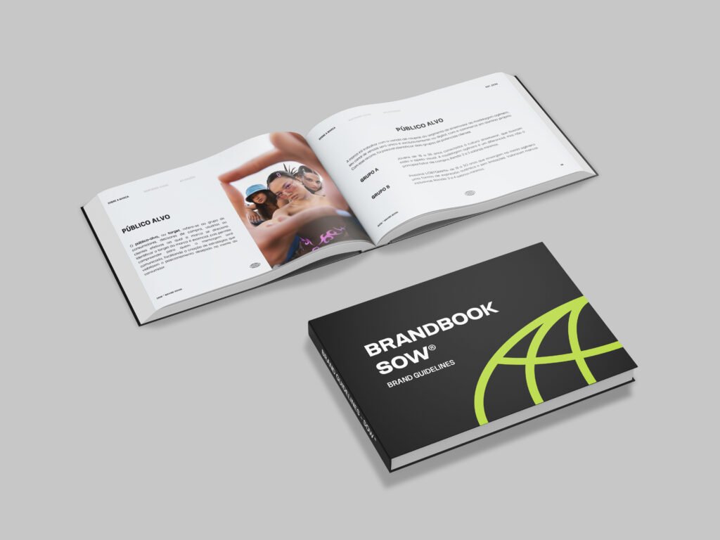
[ View Brandbook ]
The Project/Briefing
The challenge was to create a completely new genderless streetwear brand from scratch. The client brought only an initial direction: to develop a young and free brand connected to the present. From the start, we envisioned Sow as a brand primarily aimed at Gen Z, an audience that sees fashion as personal expression and identity affirmation. We delivered naming, positioning, visual identity, and a complete brand book, building a brand that breaks standards, builds community, and offers inclusive, authentic, and personality-driven fashion.
Naming
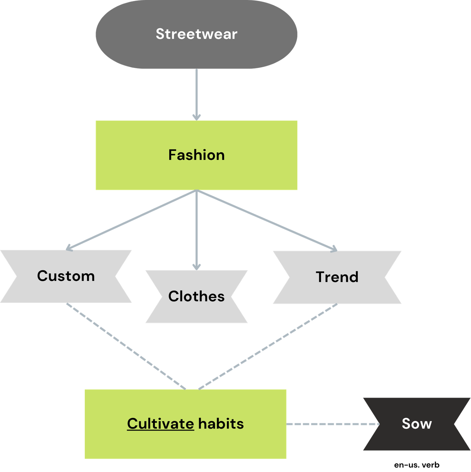
“Sow” is an English verb that means “to sow,” and it reflects the idea of “cultivating” habits, trends, and new forms of expression (the essence of the brand). Furthermore, its pronunciation sounds like the word “sou” in Portuguese, which means “I am,” a statement about identity and belonging. This polysemic connection reinforces the brand’s purpose of dressing beyond the body: where each piece is an extension of who we are, carrying the soul and story of the person wearing it.
Creative process:
To arrive at the brand name, we used a methodology of word associations, starting with the term “Streetwear” which gave rise to a series of new concepts. We grouped the key words “custom” and “trend”, two fundamental pillars of fashion, which together refer to the idea of ”cultivating habits”. And from this combination, we arrived at a synonym for “cultivate”, the word “Sow”.
Origin of the term:
English language
Pronunciation:
/soʊ/ – In english, the pronunciation of the word is the same as the adverb/conjunction “so”. The first letters “so” are read together adding the “w”, which has a short “u” sound, as the words “foot/good”. In portuguese, we can pronounce “Sow” as “sou”, the verb.
Brand DNA:
- Free: breaks rigid standards and promotes inclusion and plurality, translating the brand’s true purpose.
- Versatile: pieces that adapt to different bodies, styles, and occasions.
- Modern: connected to cultural and social changes with innovation.
- Expressive: encourages freedom of self-expression through clothing.
- Young: represents dynamism, authenticity, and connection with the present.
Brand Plataform
The brand platform is the strategic guide that defines who Sow is, how it positions itself, and what it delivers to the world. It sets the pillars that drive decisions, communication, and identity, building consistency across all touchpoints.
Purpose (Why does the brand exist?)
To deconstruct standards and create free, inclusive, and authentic fashion that dresses identities, not labels, celebrating each person’s unique essence.
Personality (How does it behave?)
- Confident, knows who it is and what it stands for.
- Inspiring, encourages new ways of seeing the world.
- Disruptive, questions norms and proposes the new.
- Urban, connected to street culture.
- Conscious, acts with social and environmental responsibility.
Tone of Voice (How does it communicate?)
Provocative, authentic, inclusive, and empowering.
Positioning (What does it deliver?)
Fashion that goes beyond clothing: connecting style, purpose, and expression. Created for a generation that uses fashion as identity, in a manifesto of freedom.
Values (What does it believe in?)
- Quality: High-standard, durable pieces.
- Authenticity: Designs that reflect each person’s essence.
- Diversity: Genderless fashion with no labels.
- Sustainability: Conscious and responsible production.
- Innovation: Creating trends with purpose.
Taglines (What phrases express the brand’s spirit?)
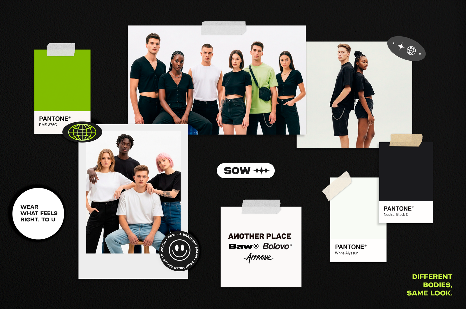
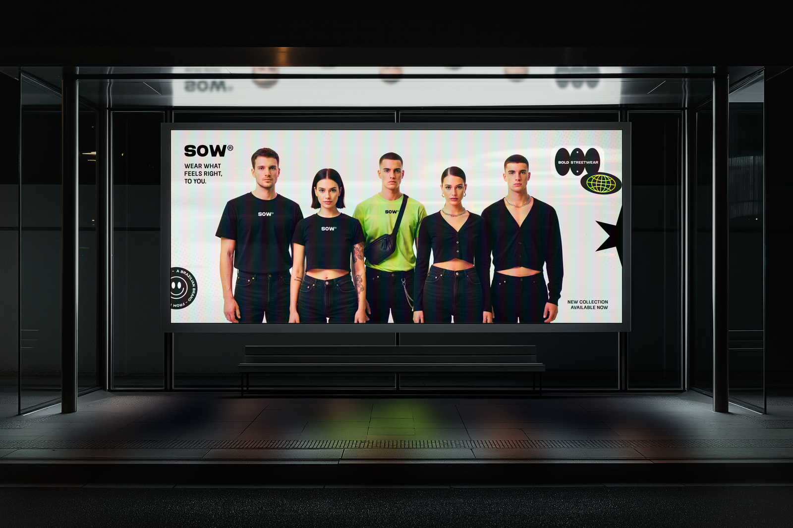
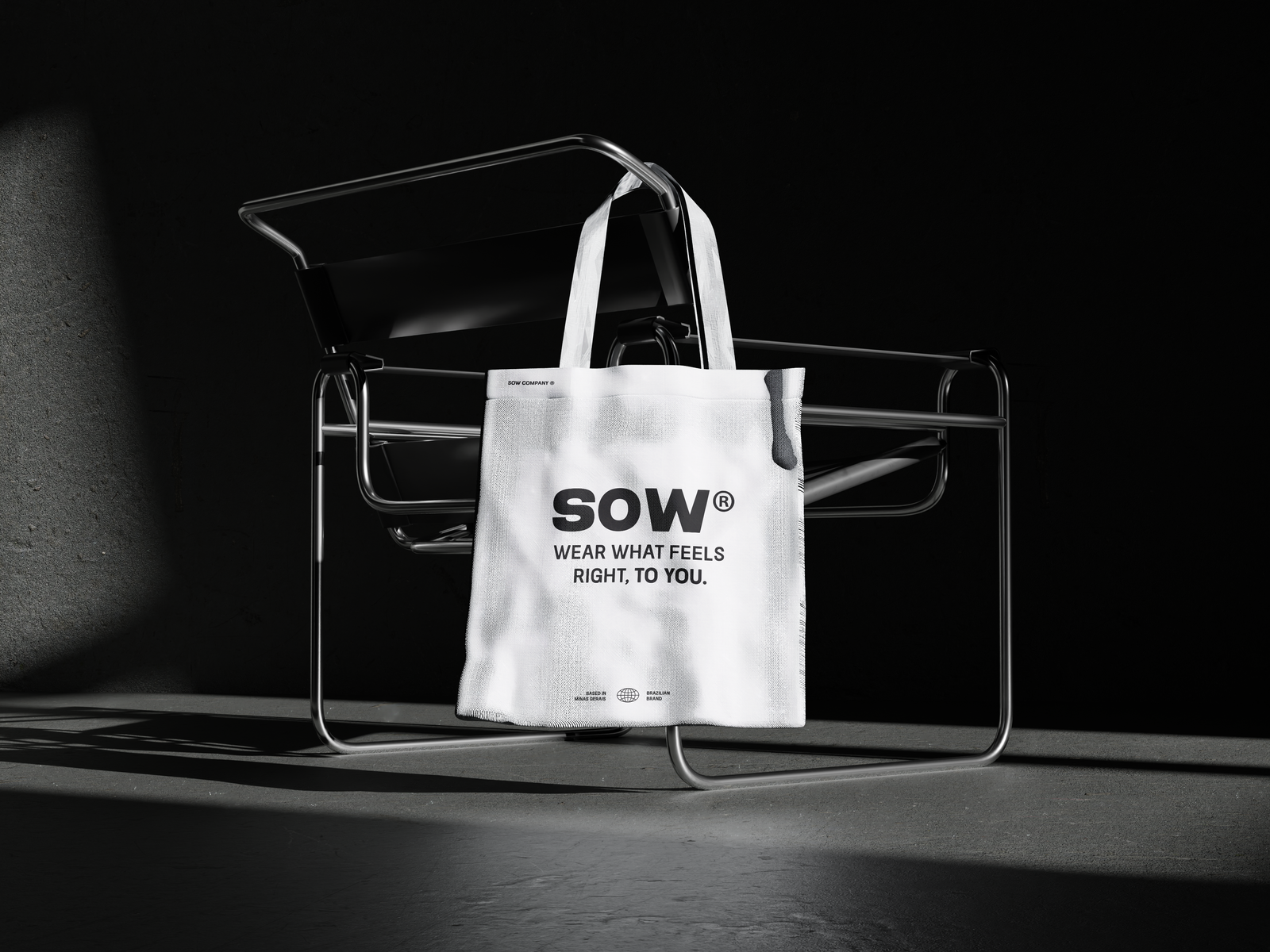
1. Wear what feels right, to you. / 2. Streetwear for who you are/
3. Bold streetwear for bold people.
Visual Identity
A well-structured visual identity system is essential to convey a brand’s message and positioning. It represents its essence and is the main way for the public to recognize and connect with the brand.
Main concept
After a brief market analysis, we noticed that most brand competitors (listed in the moodboard above), inside the streetwear segment, adopt typographic logos composed only of text without elaborate symbols. This minimalist approach reinforces sobriety, versatility, and easy application across different formats, maintaining a consistent and modern identity. For this reason, we decided that typography would play a central role in building Sow’s identity.
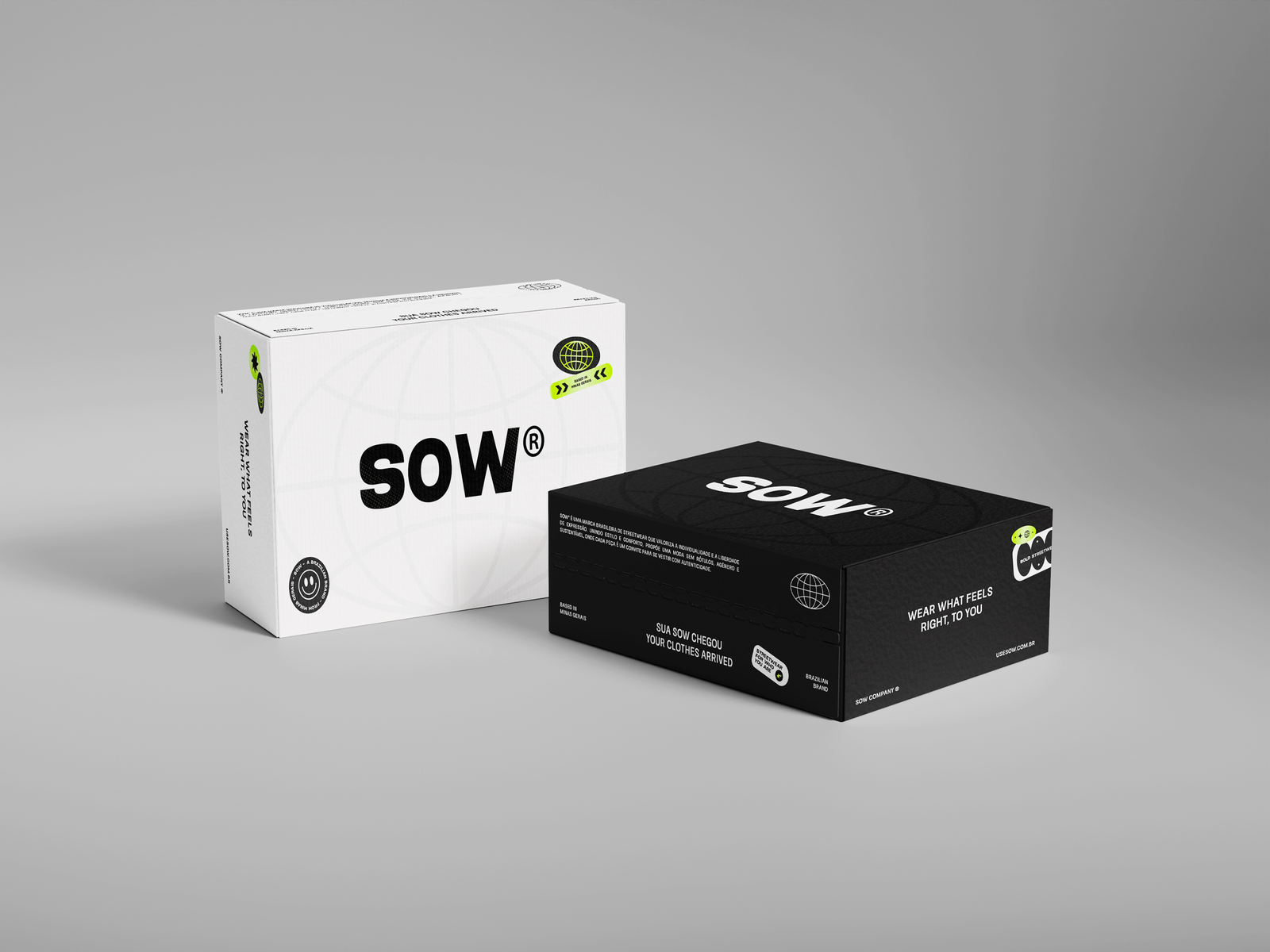
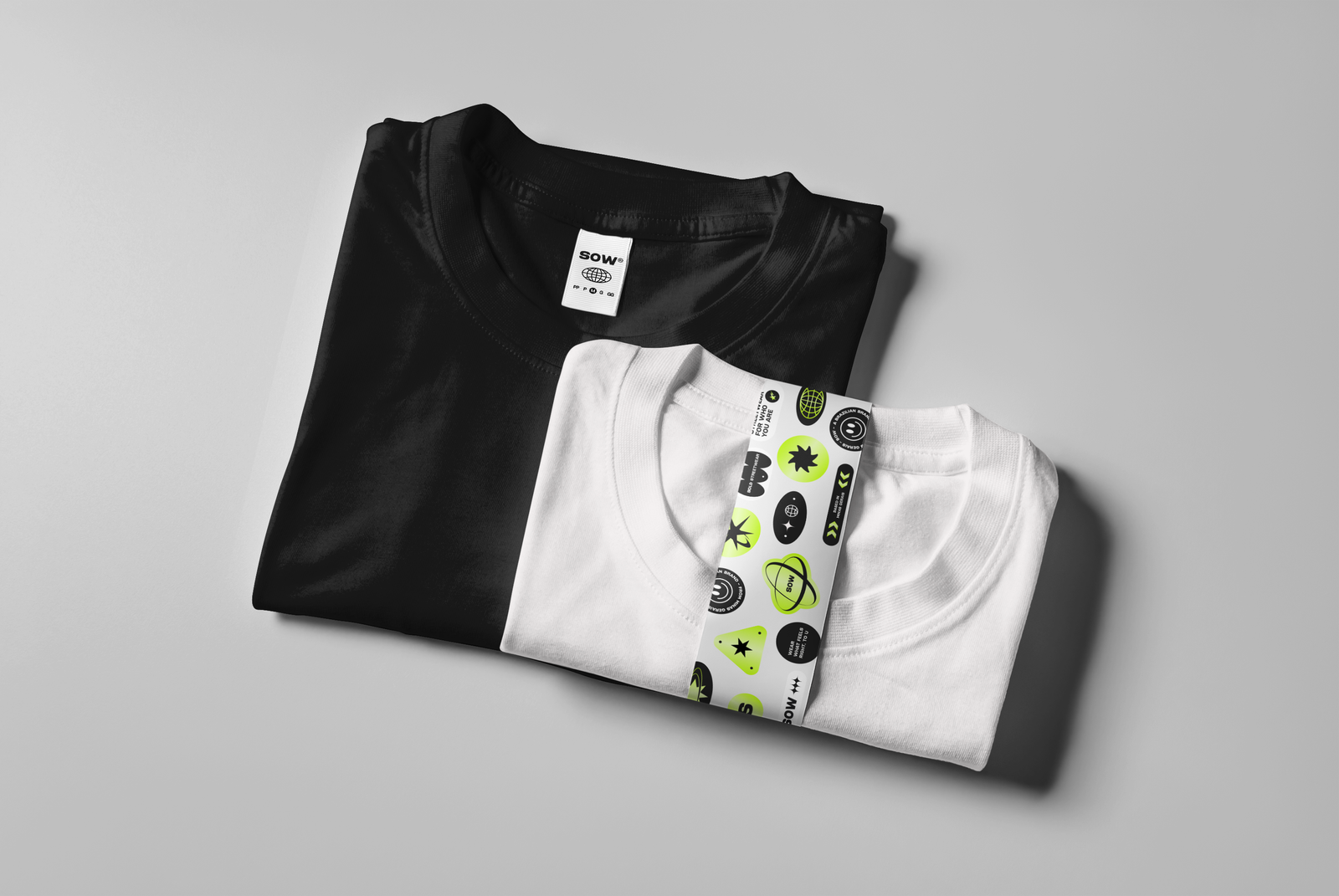
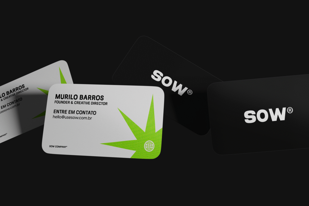
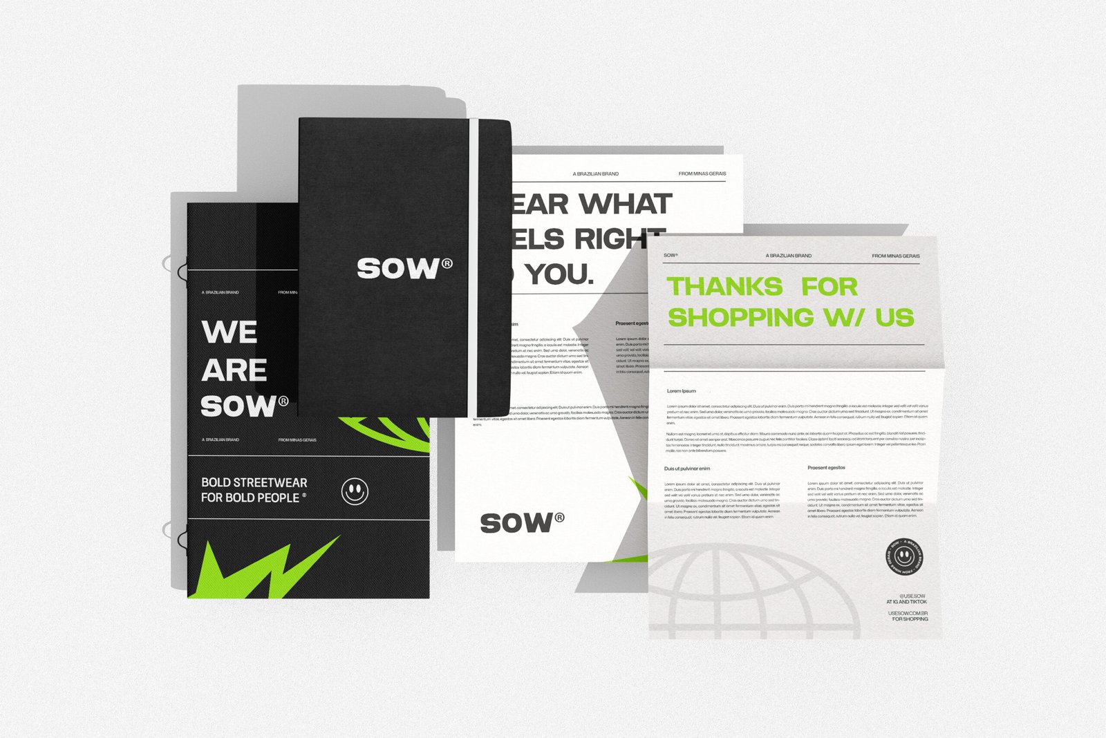
The construction of Sow’s logo prioritized a clean, robust and timeless font, reinforcing its strong personality. We chose the “Akimbo” typeface in “Black” weight to write the brand name, making fine adjustments to create a symmetrical composition and personalize the font. The final logo features the name “SOW” in all caps, accompanied by the ® symbol (which indicates a trademark registered with the appropriate agency, in this case, the INPI in Brazil).
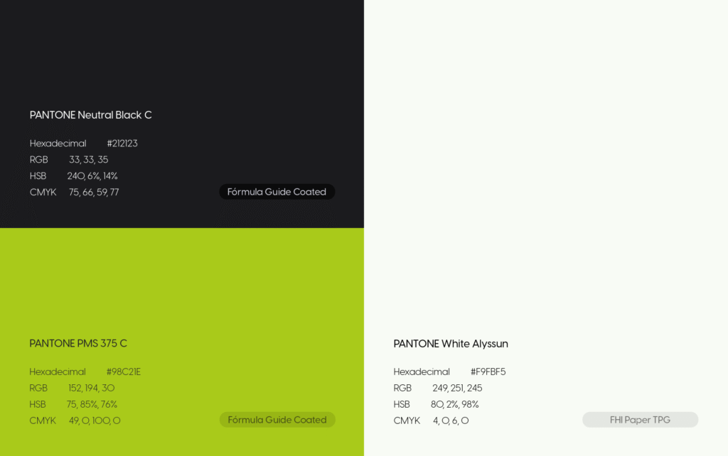
Colors
Present in urban environments and widely used by many streetwear brands, black Neutral Black C and white White Alyssun were chosen as the main colors of the palette, becoming the brand’s primary colors. As neutral tones, they are easy to apply and ensure the versatility and timelessness embedded in Sow’s DNA. And to bring more contrast and dynamism to the main composition, a vibrant green PMS 375 C was chosen as the secondary color. Similar to the shade used on Charli XCX’s brat Viral on social media, the term “brat” was chosen as the word of the year for 2024 by the Collins Dictionary and gained a new meaning, being used as an adjective to describe self-confidence and independence — characteristics of Sow’s buyer persona. album cover, it represents youth and renewal, characteristics that reflect the spirit of the brand’s audience.
Interestingly, the black-white-green combination is also present in the agender pride flag, subtly reinforcing the values of diversity and inclusion that Sow seeks to communicate.
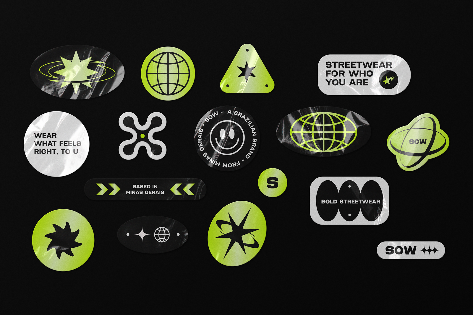
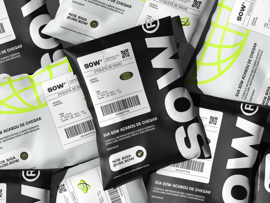
Support Graphics/Illustrations
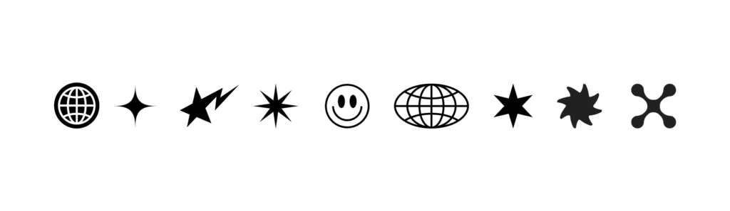
The supporting graphics elements of Sow’s visual identity were created to add value to the project, expanding brand applications beyond the simplicity of the logo. They combine influences from brutalism Brutalism is manifested through the use of rigid and structured geometric shapes, conveying solidity and functionality. and Y2KThe Y2K influence appears in futuristic and holographic symbols that refer to digital and technological elements from 00`s. aesthetics, resulting in a striking and contemporary visual composition.
It’s also possible to create complementary illustrations for the brand by combining these graphics with taglines and parts of the logo, as in the stickers below. The possibilities are endless.
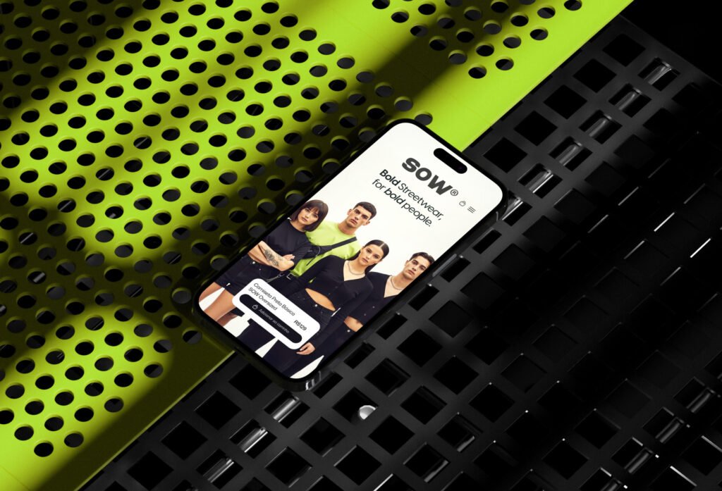
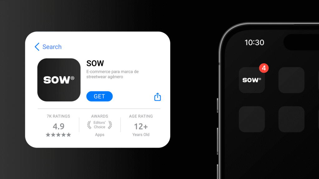
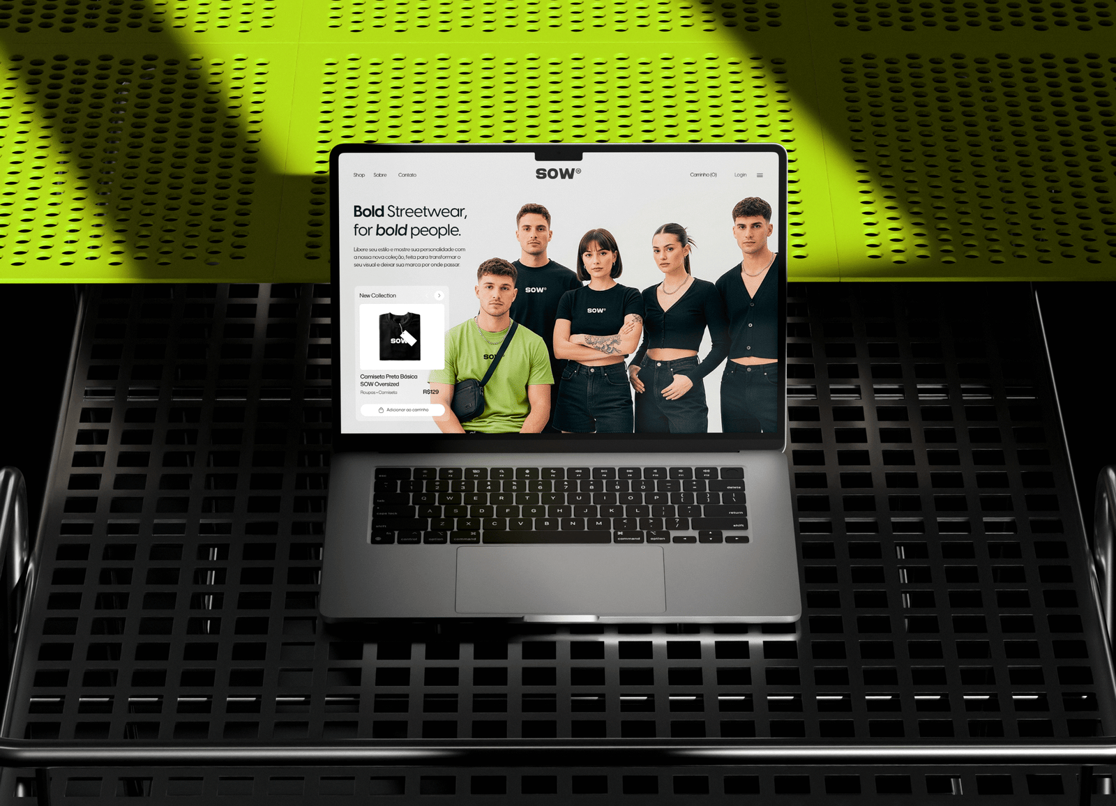
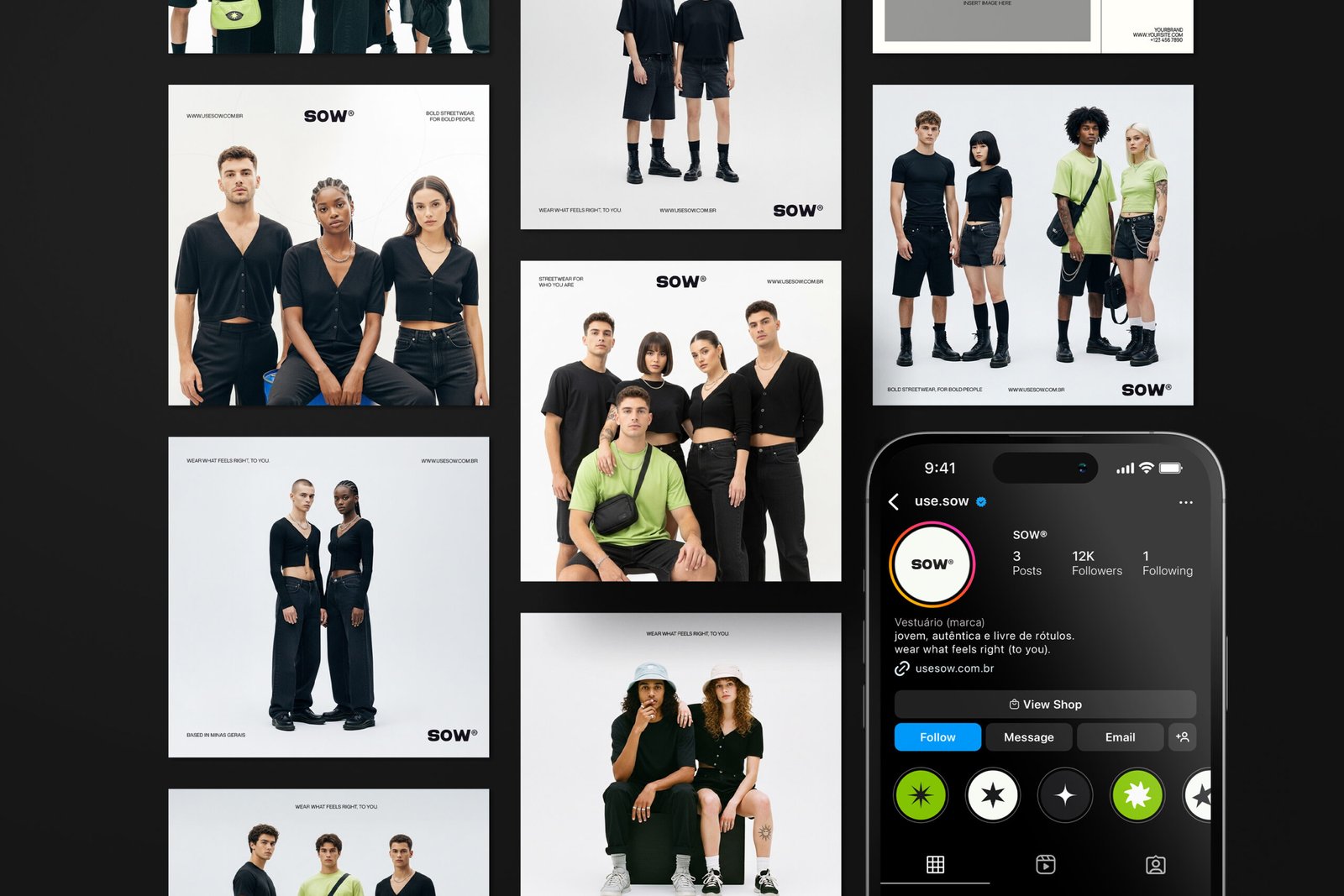
Brand Aplications
Sow – Branding project for a genderless fashion brand
Final project developed to obtain a bachelor’s degree in Advertising at UEMG. All assets in this project are protected against plagiarism through prior registration ©. Partial or total reproduction without the author’s permission is prohibited.
Thank you for your attention.
Shall we create something amazing together? Request a [Quote]